Getting Started
QuickCharts builds figures from a small set of plotting primitives:
Chartcreates a single set of axes.add_line,add_scatter,add_bar,add_contour, andadd_quiveradd data series.Annotationandadd_annotationadd plot-area notes.ChartGridcombines charts into multi-panel figures.VideoBuilderandadd_frameaccumulate frames for animation export.savewrites figures to.pdf,.png,.svg, or.ps, and writes videos to.mp4or.avi.
Figure sizes are specified in typographic points. The exported cm constant is provided for convenient centimeter-based sizes.
Chart and ChartGrid can also be displayed inline in rich Julia frontends such as VS Code and notebook environments.
A First Chart
Load the package, prepare data, and create a chart:
using QuickCharts

x = collect(0:0.5:6)
y = sin.(x)

chart = Chart(
    size = (15cm, 10cm),
    title = "Sine Response",
    font_size = 12.0,
    background = :white,
    xlabel = "`x`",
    ylabel = "`sin(x)`",
    legend = :top_right,
)
Chart(size=425.1968503937008 x 283.46456692913387 pt, title="Sine Response", axes="`x`" vs "`sin(x)`", series=0, annotations=0, legend=:top_right)Add a line series. Series labels appear in the legend; an empty label keeps a series out of the legend.
add_line(chart, x, y; mark = :circle, label = "`sin(x)`")LineSeries(n=13, label="`sin(x)`", style=:solid, mark=:circle, order=1)Export the figure:
save(chart, "getting-started.svg")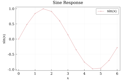
QuickCharts renders to .pdf, .png, .svg, and .ps.
Contours
Contour plots use a rectilinear grid described by x, y, and a z matrix with size (length(y), length(x)):
cx = collect(range(-2, 2; length=31))
cy = collect(range(-2, 2; length=25))
cz = [sin(xi) * cos(yi) for yi in cy, xi in cx]

line_contour = Chart(
    size = (10cm, 7cm),
    title = "Line Contours",
    background = :white,
    xlabel = "`x`",
    ylabel = "`y`",
)

add_contour(line_contour, cx, cy, cz; levels=-0.9:0.3:0.9, color=:black, label="`sin(x) cos(y)`")
save(line_contour, "getting-started-contour-lines.svg")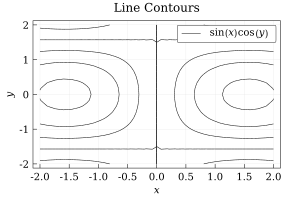
Filled contours draw isolines too unless line_style = :none:
filled_contour = Chart(
    size = (10cm, 7cm),
    title = "Filled Contours",
    background = :white,
    xlabel = "`x`",
    ylabel = "`y`",
)

add_contour(
    filled_contour,
    cx,
    cy,
    cz;
    filled = true,
    levels = -0.9:0.3:0.9,
    color = :black,
    colorbar = :right,
    colorbar_label = "`sin(x) cos(y)`",
)
save(filled_contour, "getting-started-contour-filled.svg")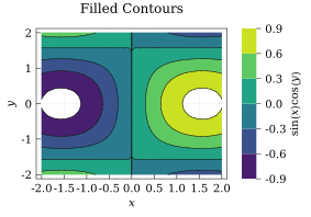
filled_no_lines = Chart(
    size = (10cm, 7cm),
    title = "Filled Without Lines",
    background = :white,
    xlabel = "`x`",
    ylabel = "`y`",
)

add_contour(
    filled_no_lines,
    cx,
    cy,
    cz;
    filled = true,
    levels = -0.9:0.3:0.9,
    line_style = :none,
    colorbar = :right,
)
save(filled_no_lines, "getting-started-contour-filled-nolines.svg")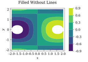
Vector Fields
Quiver plots draw a vector (U, V) at every (x, y) grid point. As with contours, the component matrices must have size (length(y), length(x)):
qx = collect(range(-2, 2; length=13))
qy = collect(range(-1.5, 1.5; length=11))
qu = [-yi for yi in qy, xi in qx]
qv = [xi for yi in qy, xi in qx]

quiver_chart = Chart(
    size = (10cm, 7cm),
    title = "Rotational Field",
    background = :white,
    xlabel = "`x`",
    ylabel = "`y`",
)

add_quiver(
    quiver_chart,
    qx,
    qy,
    qu,
    qv;
    color = :royal_blue,
    max_length = 11,
    head_length = 3,
)
save(quiver_chart, "getting-started-quiver.svg")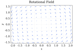
Arrow lengths are normalized in screen space. Use max_length to set the longest arrow length and stride to thin dense grids. See the Field Plots Tutorial for contour customization, flat vector inputs, and combined contour-quiver plots.
Text and Math
Titles, labels, legends, series tags, and annotations can include inline math. Math spans can be delimited with backticks, such as $"`u_x(t)`"$, or with escaped dollar signs in normal Julia strings, such as "\$sigma_n\$" or "\$σ_n\$". Backticks are preferred because they do not need escaping.
math_chart = Chart(
    size = (9cm, 6cm),
    title = "Response `u_x(t)`",
    background = :white,
    xlabel = "`t`",
    ylabel = "`u_x`",
    legend = :top_right,
)

add_line(math_chart, x, exp.(-0.2 .* x) .* sin.(x); label = "`e^(-0.2t) sin(t)`")
save(math_chart, "getting-started-math.svg")
The math syntax is Typst-like and supports common expression features, including subscripts, superscripts, fractions, brackets, and bold text. Use parentheses for grouping instead of braces; for example, write $`(a + b)/(c + d)`$ and $`x_(i+1)^2`$ rather than brace-grouped forms. The frac function is not required for fractions, because slash notation can turn grouped expressions into fractions directly. Text that should remain upright inside math can be enclosed in single or double quotes. For example,
label = "`σ_'vm'` [MPa]"
label = "`σ_\"vm\"` [MPa]"
A single quote immediately following a valid math base denotes a prime. Double quotes always delimit upright text, so they are unambiguous in that context.
Colors
Colors can be provided as named symbols, RGB/RGBA tuples, or Color values. Named colors accept underscore-free aliases, so :royal_blue and :royalblue refer to the same color. When a color symbol is misspelled, QuickCharts tries to suggest the closest valid name.
You can also derive related colors with lighten and darken, or sample a built-in Colormap such as :viridis or :magma:
cmap = Colormap(:viridis)

color_chart = Chart(
    size = (15cm, 10cm),
    title = "Styled Series",
    background = :white,
    xlabel = "`x`",
    ylabel = "`y`",
    legend = :bottom_left,
)

add_line(color_chart, x, sin.(x); color = lighten(:royal_blue, 0.15), line_width = 0.9, label = "lighter alias")
add_line(color_chart, x, cos.(x); color = darken(:tomato, 0.15), line_width = 0.9, label = "darker named color")
add_scatter(color_chart, x, 0.7 .* sin.(x .- 0.5); color = cmap(0.8), label = "viridis sample")
save(color_chart, "getting-started-colors.svg")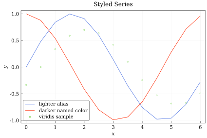
When color = :auto, QuickCharts cycles through its default chart palette.
The alias behavior and typo suggestions are available directly through Color:
Color(:royalblue) == Color(:royal_blue)truejulia> Color(:ligthblue)ERROR: ArgumentError: Color: unknown color symbol :ligthblue. Did you mean :lightblue?
Video Generation
Use VideoBuilder when you want to render a sequence of Chart or ChartGrid values to a video file. Each frame is stored when you call add_frame, and all frames must render to the same pixel size. Set freeze_scale=true to reuse the view from frame 1 across the whole animation, and use bounds_factor>1 when that frozen view needs extra space.
video = VideoBuilder(framerate = 10, freeze_scale = true, bounds_factor = 1.05)
video_x = collect(range(0, 2π; length = 120))

for phase in range(0, 2π; length = 12)
    frame = Chart(
        size = (10cm, 7cm),
        title = "Phase Sweep",
        background = :white,
        xlabel = "`x`",
        ylabel = "`y`",
        legend = :top_right,
    )

    add_line(frame, video_x, sin.(video_x .+ phase); color = :royalblue, label = "`sin(x + ϕ)`")
    add_line(frame, video_x, cos.(video_x .+ phase); color = Colormap(:magma)(0.75), label = "`cos(x + ϕ)`")
    add_frame(video, frame)
end

save(video, "getting-started-animation.mp4")
The default codec is selected from the file extension. At the moment, QuickCharts supports .mp4 and .avi output.